> ## Documentation Index
> Fetch the complete documentation index at: https://docs.roark.ai/llms.txt
> Use this file to discover all available pages before exploring further.
# Reports
> Analytics dashboards and insights for voice AI performance
## Overview
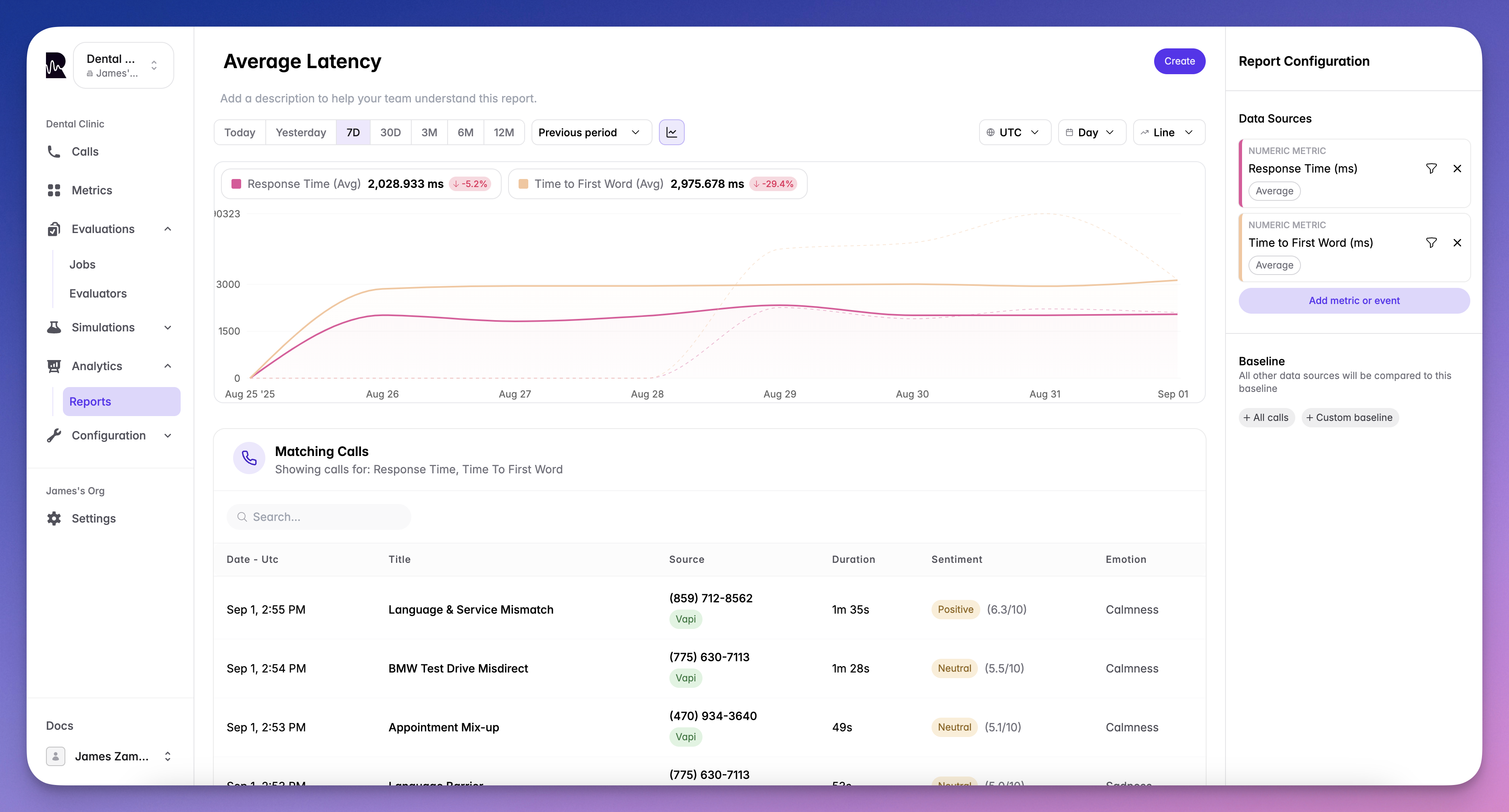
Reports allow you to chain multiple metrics together to create comprehensive analytics dashboards. Track trends, compare performance, and drill down into specific calls - all from a single view.
 ## What You Can Report On
### Events
Track occurrences of specific events in your system:
* `evaluation_failed` - When calls fail quality checks
* `task_completed` - Successful objective completion
* `escalation_triggered` - Customer requested human agent
* `tool_call_failed` - Function execution errors
* Custom events defined in your system
### Metrics
Analyze performance indicators over time:
* `response_time` - Agent response latency
* `sentiment_score` - Customer satisfaction trends
* `interruption_count` - Conversation flow issues
* `call_duration` - Efficiency metrics
* Any custom metrics you've defined
**Aggregation Options:**
* **Count** - Total number of occurrences
* **Average** - Mean value across calls
* **Sum** - Total combined value
* **Minimum** - Lowest recorded value
* **Maximum** - Highest recorded value
* **Median** - Middle value (50th percentile)
* **P90** - 90th percentile value
* **P95** - 95th percentile value
## Baseline Configuration
Set context for your data with flexible baseline options:
View data as a percentage against all your calls:
```
Failed evaluations: 12% of all calls
High frustration: 8% of all calls
```
Use another metric or event as your comparison:
```
Failed evaluations: 45% of high-frustration calls
Tool failures: 23% of escalated calls
```
Compare against the sum of another metric:
```
Agent response time: 32% of total call duration
Silence time: 18% of conversation time
```
## Visualization Options
### Line Graph
Track trends over time with detailed line charts:
Perfect for:
* Identifying patterns and trends
* Comparing multiple metrics
* Spotting anomalies
### Number Chart
Display key metrics as single values or comparisons:
## What You Can Report On
### Events
Track occurrences of specific events in your system:
* `evaluation_failed` - When calls fail quality checks
* `task_completed` - Successful objective completion
* `escalation_triggered` - Customer requested human agent
* `tool_call_failed` - Function execution errors
* Custom events defined in your system
### Metrics
Analyze performance indicators over time:
* `response_time` - Agent response latency
* `sentiment_score` - Customer satisfaction trends
* `interruption_count` - Conversation flow issues
* `call_duration` - Efficiency metrics
* Any custom metrics you've defined
**Aggregation Options:**
* **Count** - Total number of occurrences
* **Average** - Mean value across calls
* **Sum** - Total combined value
* **Minimum** - Lowest recorded value
* **Maximum** - Highest recorded value
* **Median** - Middle value (50th percentile)
* **P90** - 90th percentile value
* **P95** - 95th percentile value
## Baseline Configuration
Set context for your data with flexible baseline options:
View data as a percentage against all your calls:
```
Failed evaluations: 12% of all calls
High frustration: 8% of all calls
```
Use another metric or event as your comparison:
```
Failed evaluations: 45% of high-frustration calls
Tool failures: 23% of escalated calls
```
Compare against the sum of another metric:
```
Agent response time: 32% of total call duration
Silence time: 18% of conversation time
```
## Visualization Options
### Line Graph
Track trends over time with detailed line charts:
Perfect for:
* Identifying patterns and trends
* Comparing multiple metrics
* Spotting anomalies
### Number Chart
Display key metrics as single values or comparisons:
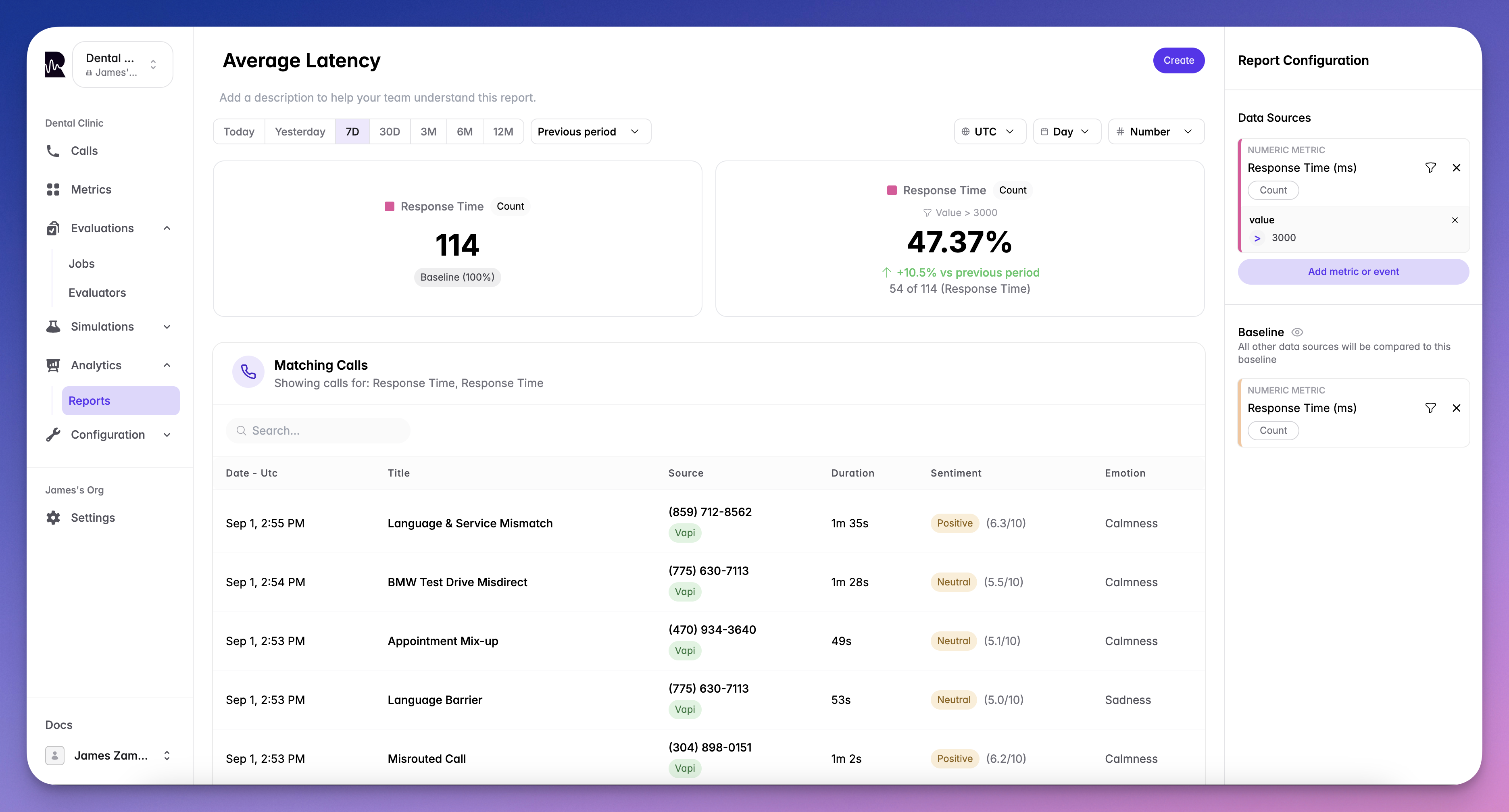 Ideal for:
* Executive dashboards
* Quick status checks
* KPI monitoring
## Time Controls
Customize your view with flexible time options:
### Time Period
* Last 24 hours
* Last 7 days
* Last 30 days
* Last 90 days
* Custom date range
### Interval Grouping
* **Hour**: For real-time monitoring
* **Day**: For daily trends
* **Week**: For weekly patterns
* **Month**: For long-term analysis
* **Year**: For annual comparisons
## Chain Multiple Metrics
Create powerful insights by combining metrics:
Compare response\_time with customer\_satisfaction to find relationships
Stack multiple metrics to see the complete picture
Combine events with metrics for context (e.g., response\_time when evaluation\_failed)
Track how one metric affects another over time
## Drill-Down to Calls
Every data point connects to the actual conversations:
1. **Click any data point** on your report
2. **View matching calls** that contributed to that metric
3. **Navigate directly** to the call screen from [Live Monitoring](/documentation/observability/live-monitoring)
4. **Analyze the conversation** with full transcript and analysis
## Use Cases
### Performance Tracking
Monitor agent efficiency and quality:
* Average response times by agent
* Task completion rates over time
* Customer satisfaction trends
### Issue Detection
Identify problems before they escalate:
* Spike in failed evaluations
* Increase in customer frustration
* Pattern of tool failures
### Business Intelligence
Track metrics that matter to your business:
* Conversion rates
* Average handle time
* Cost per successful interaction
### Compliance Monitoring
Ensure adherence to standards:
* Script compliance percentage
* Required disclosure rates
* Quality score distributions
***
## What's Next
Organize multiple reports into a single view
Monitor calls in real-time
Ideal for:
* Executive dashboards
* Quick status checks
* KPI monitoring
## Time Controls
Customize your view with flexible time options:
### Time Period
* Last 24 hours
* Last 7 days
* Last 30 days
* Last 90 days
* Custom date range
### Interval Grouping
* **Hour**: For real-time monitoring
* **Day**: For daily trends
* **Week**: For weekly patterns
* **Month**: For long-term analysis
* **Year**: For annual comparisons
## Chain Multiple Metrics
Create powerful insights by combining metrics:
Compare response\_time with customer\_satisfaction to find relationships
Stack multiple metrics to see the complete picture
Combine events with metrics for context (e.g., response\_time when evaluation\_failed)
Track how one metric affects another over time
## Drill-Down to Calls
Every data point connects to the actual conversations:
1. **Click any data point** on your report
2. **View matching calls** that contributed to that metric
3. **Navigate directly** to the call screen from [Live Monitoring](/documentation/observability/live-monitoring)
4. **Analyze the conversation** with full transcript and analysis
## Use Cases
### Performance Tracking
Monitor agent efficiency and quality:
* Average response times by agent
* Task completion rates over time
* Customer satisfaction trends
### Issue Detection
Identify problems before they escalate:
* Spike in failed evaluations
* Increase in customer frustration
* Pattern of tool failures
### Business Intelligence
Track metrics that matter to your business:
* Conversion rates
* Average handle time
* Cost per successful interaction
### Compliance Monitoring
Ensure adherence to standards:
* Script compliance percentage
* Required disclosure rates
* Quality score distributions
***
## What's Next
Organize multiple reports into a single view
Monitor calls in real-time